
 Home
 User Guide
 Developers
 Payment Gateways
 Integrations & Tools
 Site Usage
 Troubleshooting
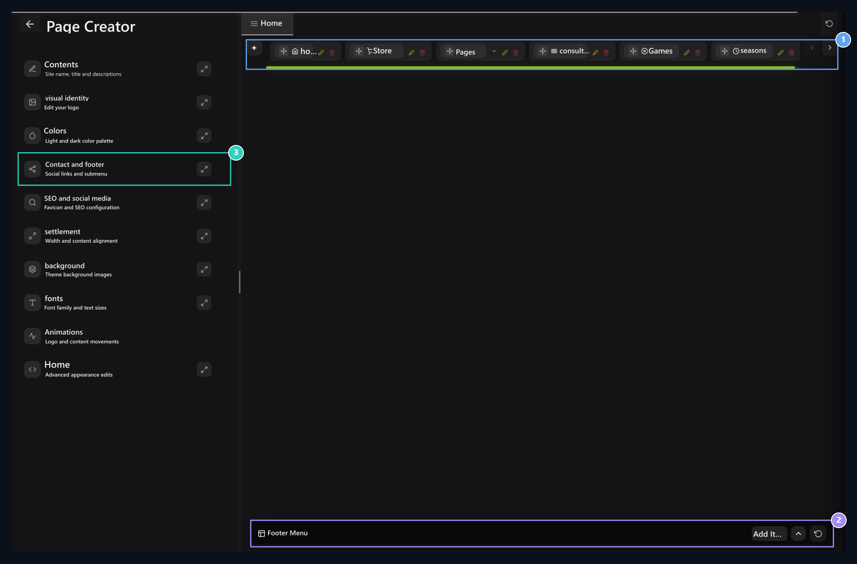
1. Navbar editing area
Use the top menu cards and the new item insert button here.
2. Footer Menu
Open the bottom menu with the arrow button; edit groups and connections.
3. Social accounts
Enter Facebook, X, Instagram, YouTube and Discord addresses from this section.
Open the item you will edit
Next to the main menu card ok, open and close the sublinks. Your own item Pen Edit that record by pressing the button. Next item for Navbar + Use the button.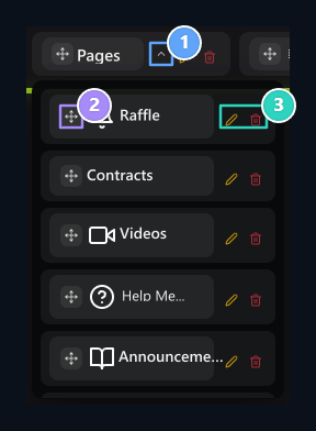
1. Open the bottom menu
The arrow next to the card, closes and closes the sublinks.
2. Transport handle
Move the item to its own order or under another main menu.
3. Edit the item
The pen opens the settings of the corresponding link; the tools of each item are separate.
Fill out common menu areas
Menu TitleThe visitor is the name to click. icon Select a icon from the field; you can search the icon when selectively opened. Top Menu Determine that the independent item or other menu has the lower connection. Menu for yourselfis the main element independent. When you select another menu, the item will be placed under it. Writing the name of another menu in the header field does not establish this relationship. RGB The option manages color effect on the menu where it is offered. Sub Information Prepare additional explanation of the item in the field. Menu type determines what will happen when clicked: Regular Link opens an address, modal window opens on the same page.Add link to a page
- Prepare menu header and icon.
- Menu Type → Normal Link Select.
- Page Type Find the target page from the selective. If the choice is required for additional products, user or page information, fill in the relevant area.
- If you enter your address Special Page Select and type in-site path or full external address.
- Tab Status Select the same or new tab with.
- Checking and controlling the upper menu relationship and appearance preferences Publish Save with.
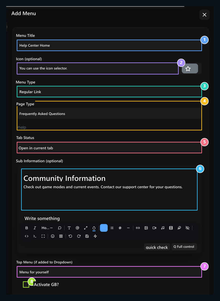
1. Menu header
Enter the name the visitor will see in the upper menu.
2. Icon
Select the icon to be used next to the menu header.
3. Menu type
Select the Normal Link to switch to a page.
4. Connection and tab
Type the target address, make the same tab or new tab selection.
5. Tab status
Select the connection to open on the existing or new tab.
6. Sub-information
Prepare additional explanation that will accompany menu element.
7. Top menu relationship
Select the menu that is connected if the bottom item will be.
8. RGB view
Open the color menu effect with this option.
What is modal, when used?
modalThe window opened on the existing page when the visitor clicks on the menu. You can use a short description or to collect several links in one window. The window content is shown instead of going to the target URL. Before preparing the modal menu Menu Type → Modal, then Modal Content Choose your choice. Text Only a description, Buttons and clickable links.Show description only with the article
- New item Menu Title Type Support Information for example.
- Select the icon and Menu Type → Modal Do.
- Modal Content → Write Only Select.
- Close Modal Text Write a description to show visitors to the area.
- If necessary Top Menu insert the item into one group with the window.
- Checking and controlling the image preferences Publish Press the button.
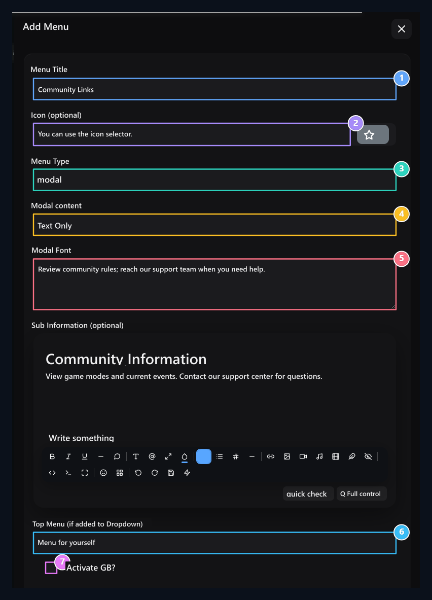
1. Menu header
Write the menu name that the visitor will click.
2. Icon
Set a icon that fits the menu.
3. Modal menu
Modal menu type Modal, just select the contents as a Font.
4. Content type
Just select the article to show a description in this window.
5. Modal post
Type the contents of the window opened by clicking on the menu.
6. Menu location
You can also place modal item under one of the top menu.
7. Color effect
Open the RGB effect of the menu header according to your request.
Offer a few target connections with buttons
Menu type modal, content Buttons Select. Add Buton Open the line with the button. Fill three areas of each line:- Push Button Head: The article to be clicked on the window is the Discord Community.
- Buton URL: It is the opener address of the button.
- Button Color: The appearance color of the button.
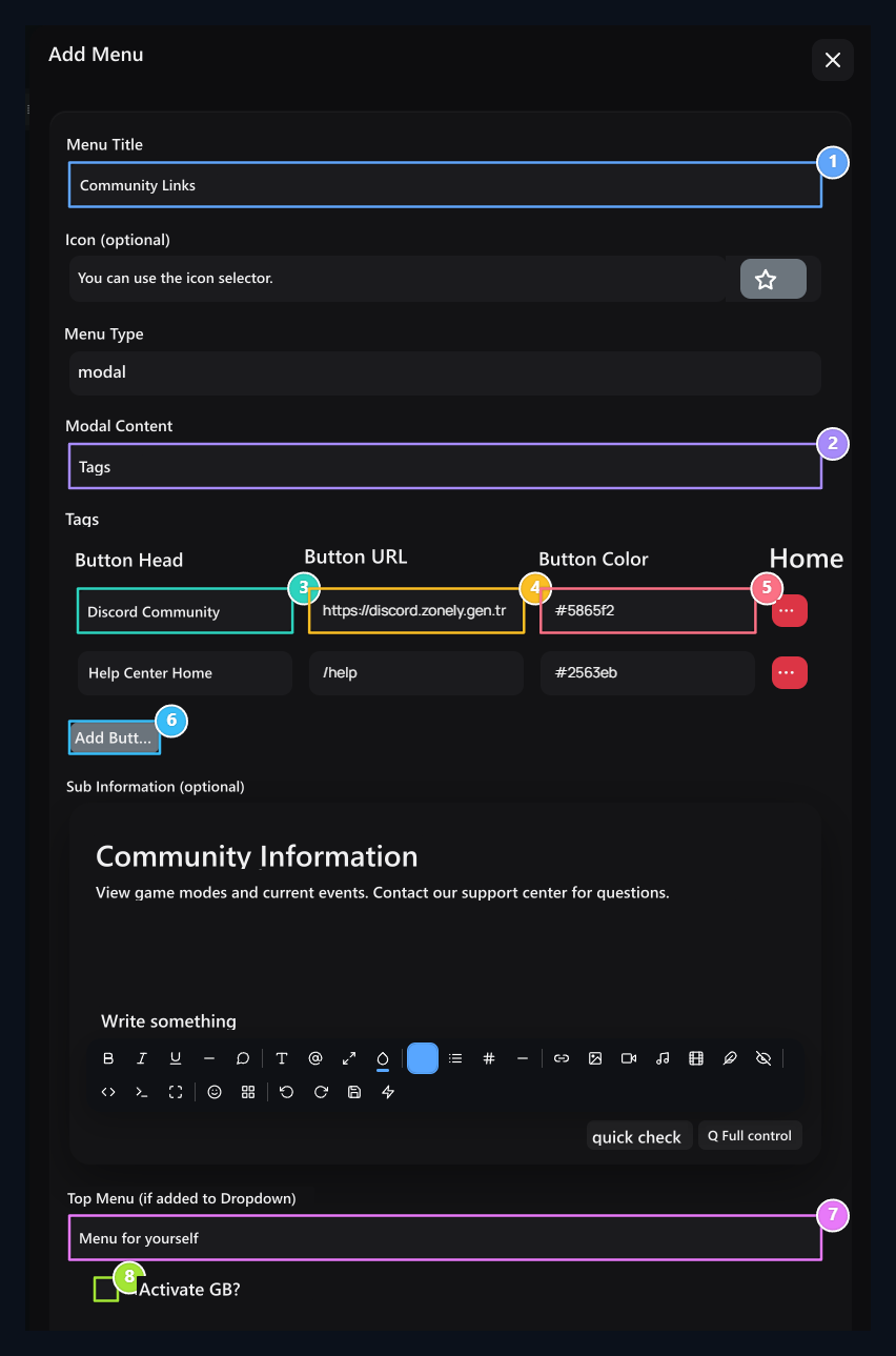
1. Menu header
Type the menu name that will open the links window.
2. Buttons mode
Show multiple target connections on the window that opens.
3. Push Button Head
Type the name of the button to click on the window.
4. Pushbutton URL
Type the address to open when click on this button.
5. Push Button Color
Select the color of the button.
6. Insert Button
Open the new line; Sil button removes the corresponding line only.
7. Top menu
Position the item under the independent or other menu.
8. RGB
Select the effect preference of menu header.
Change Navbar queue and sublinks
Card from the transport icon or header field hold. Leave the point between two main cards to sort at the same level. Take a link to the middle of the target main card to get under another menu. Leave the bottom list to the desired order when it is opened. Remove the horizontal Navbar from the open list to make the main item back the bottom link. structure main menu + bottom item as two levels. You cannot create a third level by taking a group of sublinks into another group. Keep the arrangement, delete or pop-up arrow buttons not the carrying area.Prepare footer connections
Under Preview Footer Menu open the strip with the arrow button. Group headers and sublinks appear as separate cards. Each record pen opens its own editing form.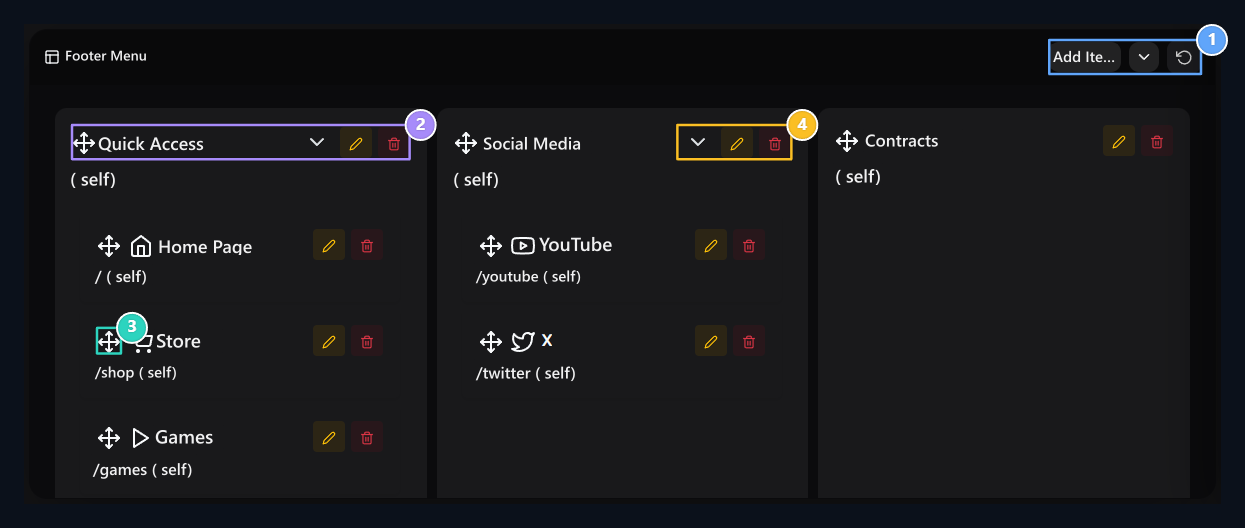
1. Footer tools
Open the panel or prepare new registration with Add Items.
2. Main group
Change the column order of the submen by carrying the group.
3. Bottom link
Sort links in group or move it to another group.
4. Group settings
Use their own editing tools of each group and connection.
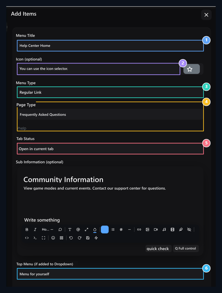
1. Bottom menu element
Type the header to show in Footer.
2. Icon
Select the icon of the footer link.
3. Menu type
Select normal connection or modal window.
4. Target link
Set the visitor’s opener address and tab selection.
5. Tab
Determine the opening of the target on the same or new tab.
6. Bottom menu group
Show the item on itself or under other menu.
Save and disconnect reset
New menu item Publish, existing item Update saved with. Drag and drop Navbar and Footer cards order and upper menu relationship are automatically saved; wait for the result notification. Your general site settings Save All button is not used instead of these menu forms. Recheck the final location of the item if there is error notification in ranking. Navbar or Footer Menu header circular arrowopens the corresponding list to the initial installation layout. When you confirm, the menu list is replaced by the installation items. Navbar and footer are reset separately.Enter social account addresses
Close Contact and footer Write Facebook, X, Instagram, YouTube and Discord addresses from the section. Use the profile, channel or invitation link as a full address.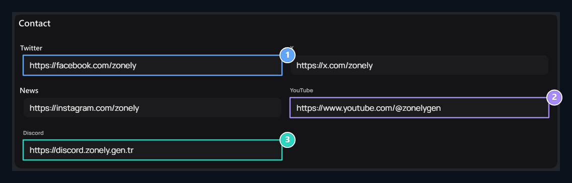
1. Social account addresses
Type full profile links for Facebook, X and Instagram.
2. YouTube
Enter the opener channel address of the visitor.
3. Discord invitation
Use the valid participation link of your community.