
 Home
 User Guide
 Developers
 Payment Gateways
 Integrations & Tools
 Site Usage
 Troubleshooting
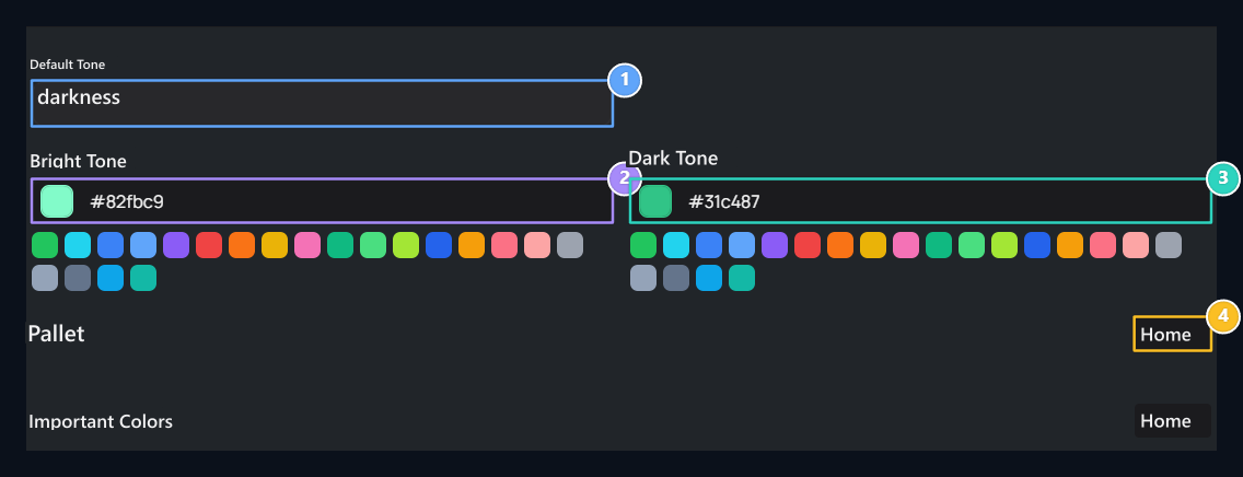
1. Default ton
Select the Bright or Dark for the first view of the visitor.
2. Bright main color
Select the main highlight color of the open view.
3. Dark main color
Customize the color of the highlight of the dark look you like.
4. Detailed pallet
Pallet and Important Colors open surfaces and status colors.
Select default view
Default Tone from list Bright or Dark Select. This selection determines the initial view of your site. Bright Tone Select your main color from the area. The color you choose also adapts to the dark appearance and adapts to the site. If you want Dark Tone You can determine a different color of highlight for dark appearance from the area. Use color selective or color code.Detailed pallet — optional
If you want to customize more detailed Pallet → Layout open the way. Top Luminous / Dark Select the look you want to edit from selection.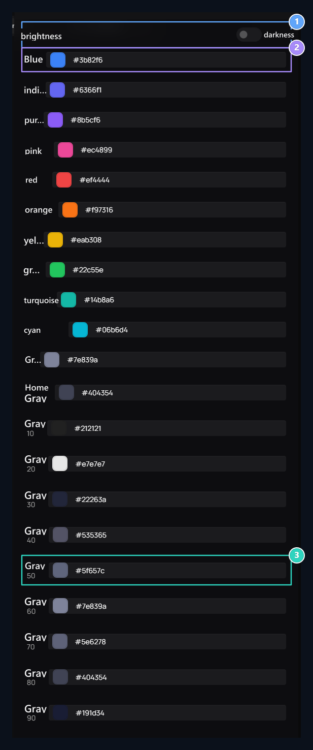
1. Edited view
Switch between the light and the Dark; two pallets are kept separately.
2. Color family
Change the code of each color from its own area.
3. Grey tones
Gray scale is useful to adjust different surface and text levels.
Important colors — optional
Important Colors change the areas is not mandatory. When you choose your main color, the system adapts the light and dark appearance. If you want to customize status messages, page floor or text color as well as Important Colors → Edit open the window and select the corresponding view.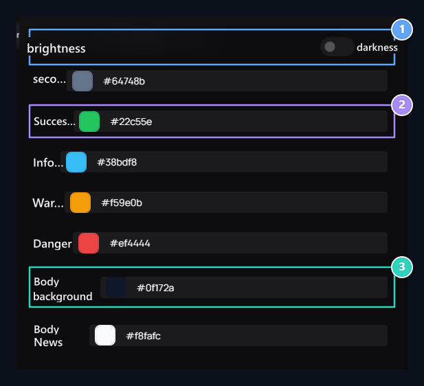
1. Ton selection
Edit the status colors separately for light and dark appearance.
2. Condition colors
Keep successful, Information, Alert and Hazard messages distinguished.
3. Body floor
Check the Body Text colors together with the Body Background.
- Secondary: The auxiliary highlight color.
- Successful / Information / Warning / Danger: The color that tells the type of process result or message. Use the tons that are easily distinguished from each other.
- Body Background: The page determines the basic floor.
- Body Text: Determines the color of the basic text; check it with the floor.